Yann Schwindowsky
Game Designer & Game Developper (Unity)
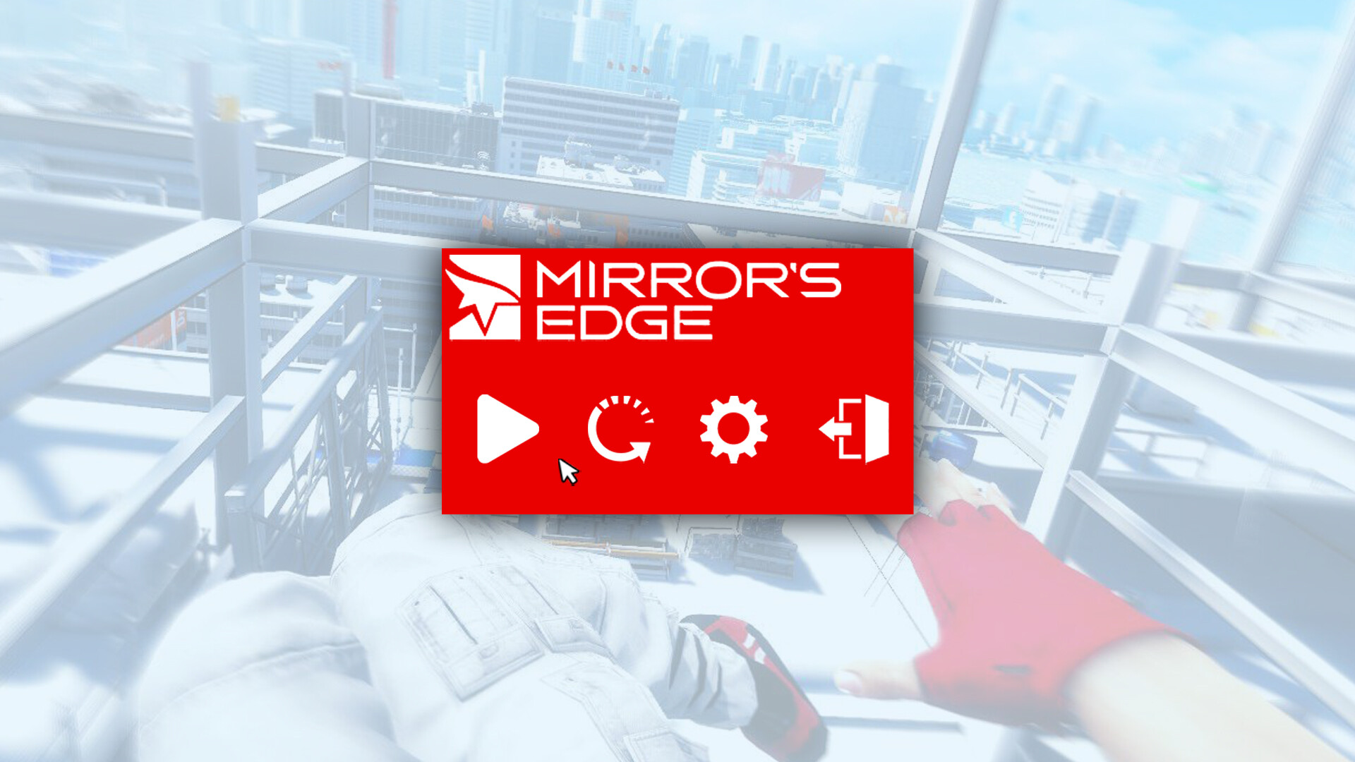
Mirror's Edge Pause Menu Reworked with Icons
The goal of this work was to rework the UI of a game by using Icons instead of texts.
I choosed Mirror's Edge because the game inspired me, but i could choose any other game.
The 4 icons represent :
1- Play / Resume the game
2- Return to last checkpoint
3- Settings
4- Return to main menu
The cursor i made is slightly different of the original, i decided to give it a strong black outline, because when i played the game itself, i sometimes lost the cursor on the screen, beacuse it was white on the white pause background, so i thought about it and made a black outline, to make it more visible, regardless of its position on the screen.